RETURN TO WORK
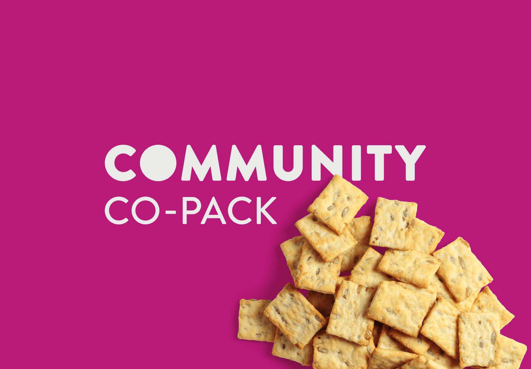
Community Co-Pack (COCO)
COCO is a community-oriented production facility that offers low barrier contract manufacturing and scales BIPOC and women-led businesses.
- Branding
- Logo
- Color Palette
- Fonts
- Brand Guideline
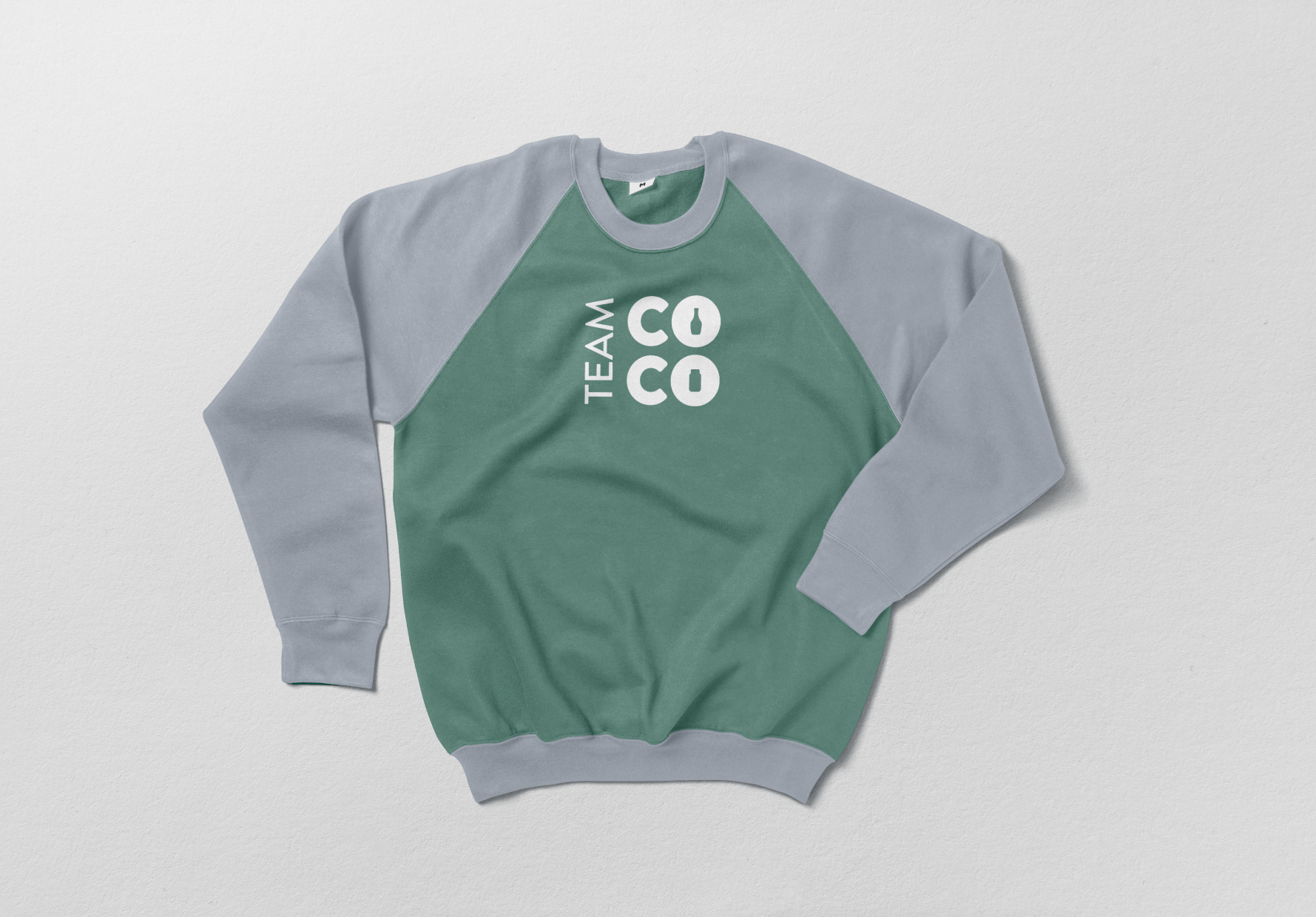
- Marketing materials
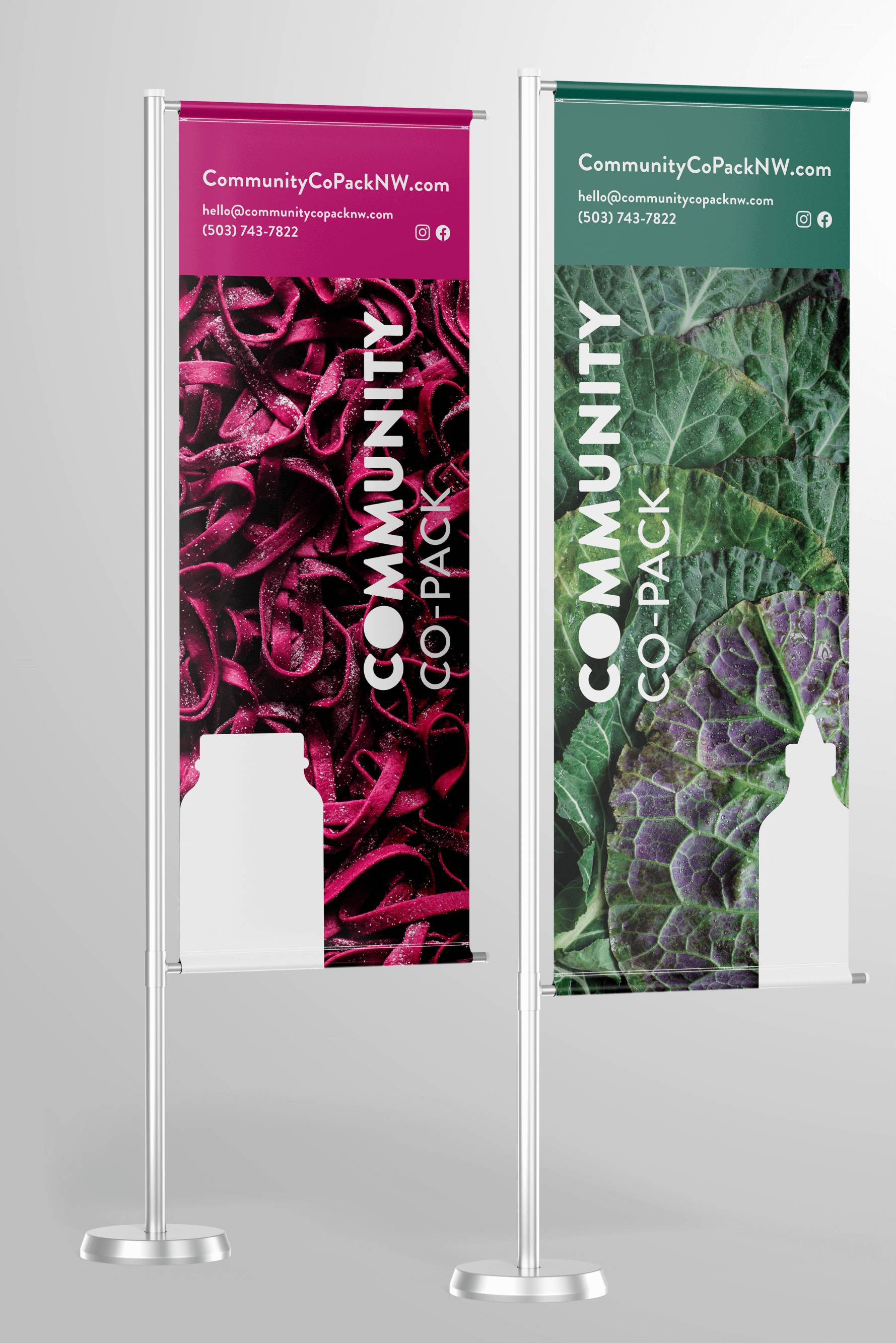
With COCO, we created a versatile, impactful brand experience to help them have a broader national reach. Because they work in the food industry, we drew heavily upon that for our inspiration.
Incredible colors of fresh ingredients informed our brand guidelines. Since the colors and textures were bold, we kept the logo and fonts clean to create a sense of balance when paired together. The result? Bright, clear, standout branding.
RETURN TO WORK
Community Co-Pack (COCO)
COCO is a community-oriented production facility that offers low barrier contract manufacturing and scales BIPOC and women-led businesses.
- Branding
- Logo
- Color Palette
- Fonts
- Brand Guideline
- Marketing materials
With COCO, we created a versatile, impactful brand experience to help them have a broader national reach. Because they work in the food industry, we drew heavily upon that for our inspiration.
Incredible colors of fresh ingredients informed our brand guidelines. Since the colors and textures were bold, we kept the logo and fonts clean to create a sense of balance when paired together. The result? Bright, clear, standout branding.